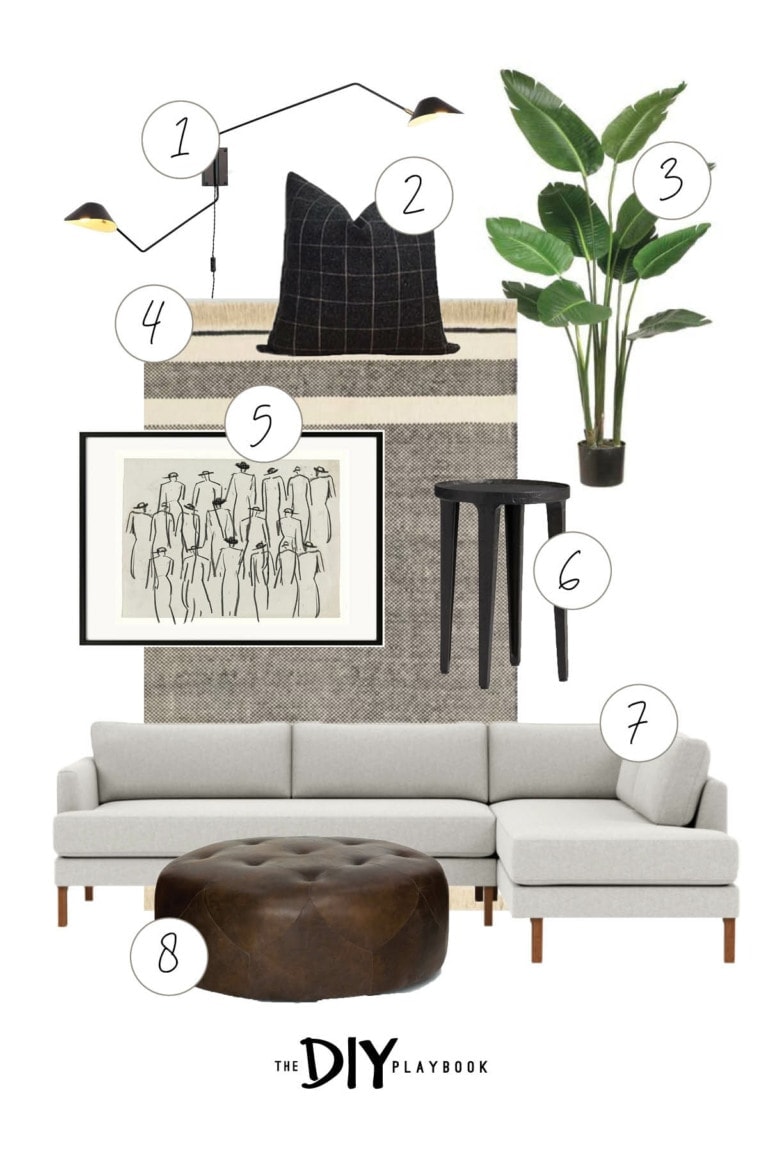
Awkward Living Room Layout Ideas: 2 Real-Life Solutions
An awkward living room layout can make even a beautiful space tricky to decorate. For today’s DIY on the Fly, I’m tackling two reader-submitted living rooms and sharing how I’d rethink each layout to make the space more functional and inviting.
Living rooms can be surprisingly tricky to lay out and awkward layouts come in all shapes and sizes. Maybe you’re working around multiple doorways, an open floor plan, lots of windows, or a room that also serves as the main walkway through your home. Sometimes you have plenty of square footage, but the furniture still never seems to land in the right place.
And that’s the tricky thing about living room layouts…there isn’t one setup that works for every space. Today’s two design dilemmas are very different, but both prove that sometimes you have to think beyond the obvious furniture arrangement to create a functional space.
Bonnie’s Design Dilemma – A Large Living Room With Tricky Traffic Flow
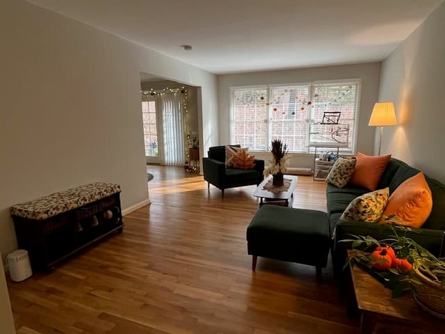
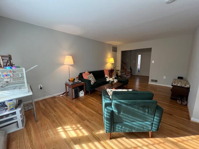
“Our living room is large and also a major walkway between the foyer and dining room, so furniture placement has always been tricky. We’d love to add a cozy reading nook or extra seating, but we don’t want to disrupt the traffic flow. We’re open to moving the existing furniture around, but would prefer not to buy new furniture or relocate our parakeet. Any ideas?”
At first glance, Bonnie’s living room has the opposite problem that many of us deal with…there’s plenty of space! But more square footage doesn’t always make furniture placement easier.
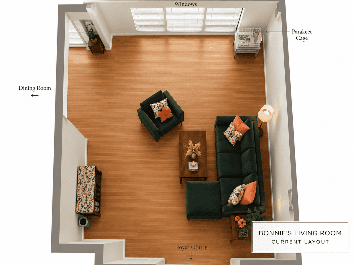
In Bonnie’s case, the living room sits between the foyer and dining room, which means people need to be able to comfortably walk through the space. Right now, the large chair floating across from the sectional sofa lands directly in that natural walkway, making the center of the room harder to navigate.
I Deal With This in My Own Living Room
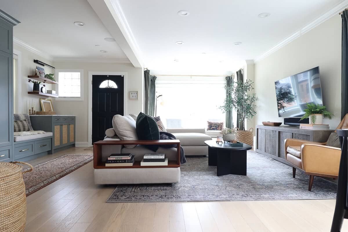
I actually have a similar layout challenge in my own home. When you walk through our front door, you enter directly into the living room, so furniture placement has always had to account for traffic flow.
That’s why I float our couch instead of pushing it against a wall. The couch defines the living area while leaving plenty of clearance behind it for a comfortable walkway through the room.
And that’s really the key with rooms like mine and Bonnie’s: it’s all about clearance and creating zones. Not every bit of open floor space needs to be filled with furniture. Sometimes that empty space is exactly what makes the room function.
The Fix: Clear the Walkway and Make Better Use of the Window Wall
1. Start with a much larger rug.
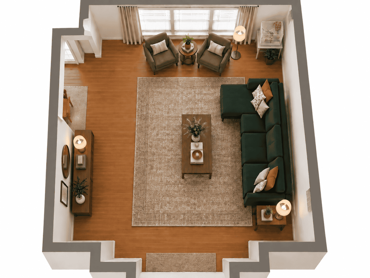
This would be my first purchase. I’d go with at least a 9×12 rug, and potentially even a 10×14 if the room dimensions allow. A large area rug will visually define the main seating area while leaving the walkway to the dining room open. It will also make this large room feel much cozier and more intentional.
More tips to buy the correct rug size right here.
2. Keep the sectional right where it is.
After studying the room from every angle, I actually think the sectional is in a pretty good spot! It’s centered nicely within the room and leaves plenty of open space on the opposite side for the main walkway between the foyer and dining room. No need to reinvent something that’s already working.
3. Move the chaise to the other end of the sectional.
Since Bonnie’s chaise is movable, I’d simply shift it to the end of the sofa closest to the windows. This keeps the extra lounging space she already has while visually connecting it to the new seating area we’re about to create. It also gets that deeper piece of furniture farther away from the entry and main traffic flow.
4. Move the chair out of the walkway and add another one.
I think this is the change that makes the biggest difference. Right now, the chair is floating in the middle of the room and sits directly in the natural path from the foyer to the dining room.
I’d move it toward the large windows and add a second coordinating accent chair with a small round side table between them. This takes advantage of all that natural light and creates a cozy conversation area that can double as a reading nook.
5. Replace the small bench with a longer, shallow console.
Once that chair is out of the middle of the room, I think there’s plenty of room for a more substantial piece along this wall while maintaining a comfortable walkway. I’d choose a slim console table that’s long enough to fill the wall (ideally at least two-thirds its length) without eating into the walkway. Then, finish it with artwork or a mirror above. It would fill out that big blank wall and add useful storage.
The biggest takeaway: Don’t look at an open walkway as wasted space. In an awkward living room layout like this, leaving enough clearance to comfortably move through the room is just as important as figuring out where the furniture goes.
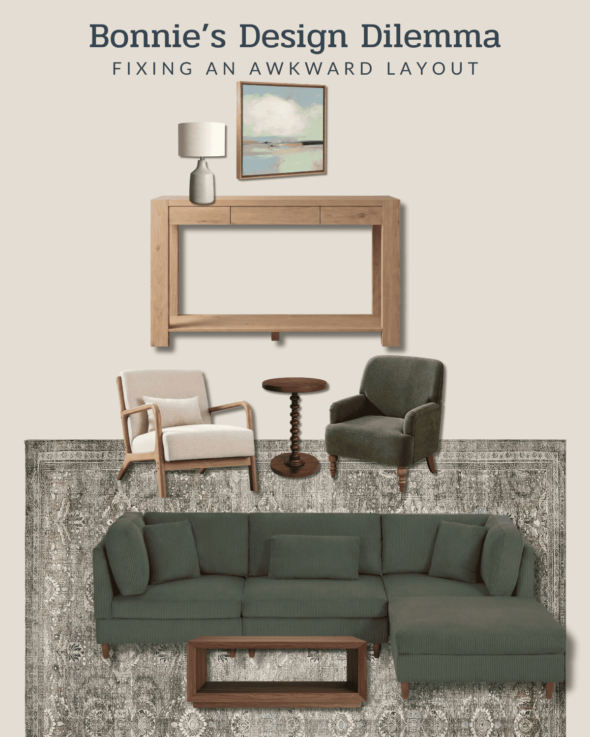
Table Lamp // Art Print // Console // Beige Accent Chair // Wood Accent Table // Olive Accent Chair // Area Rug // Green Sectional // Coffee Table
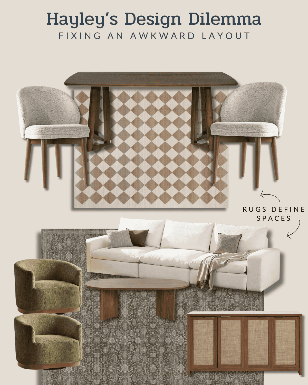
Hayley’s Design Dilemma – How to Separate a Living and Dining Room Combo
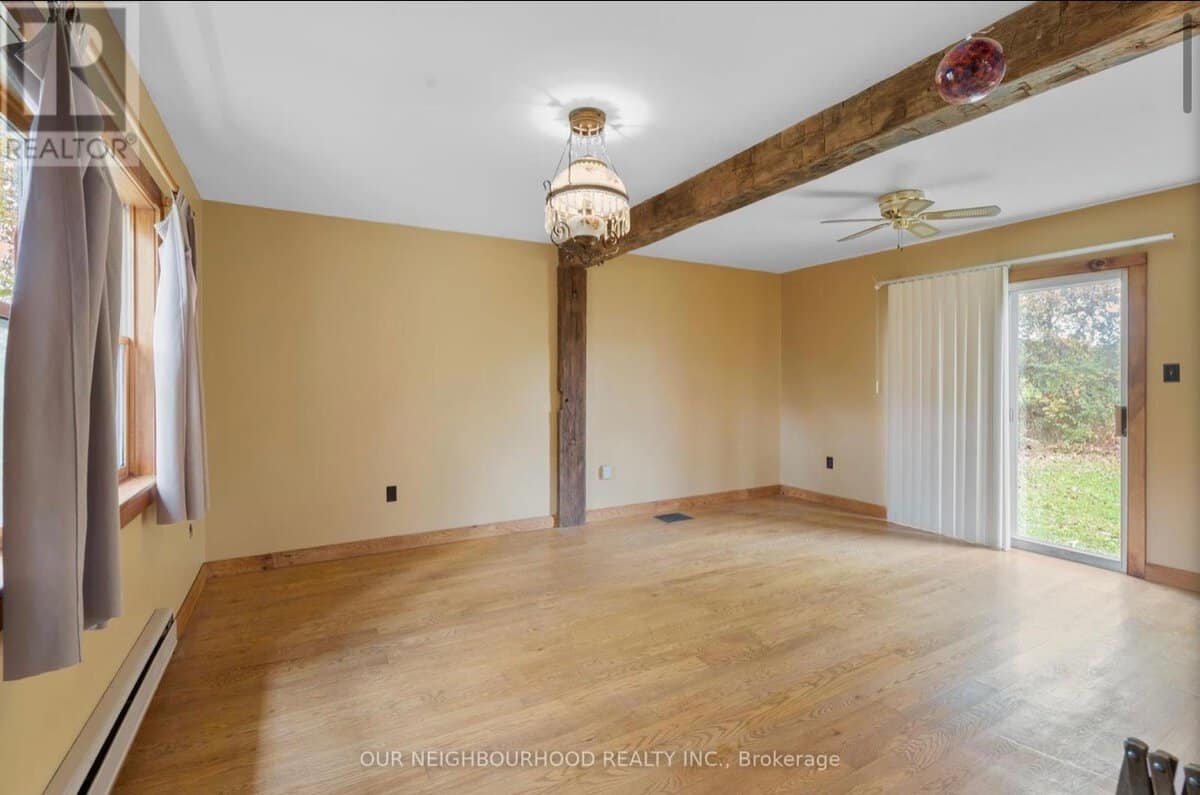
“Our new home has a large living/dining combo. How can we separate the two rooms, without it feeling too tight!”
Hayley’s layout challenge is very different from Bonnie’s. Instead of figuring out how to maintain a walkway through her living room, she has one large open space that needs to serve two completely different purposes.
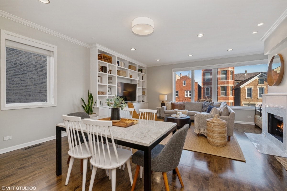
I’ve dealt with this one before, too! In our old Chicago condo, the main living space was completely open, with the living room flowing into the dining area and then into the kitchen. There weren’t any walls indicating where one room ended and the next began, so I had to create those boundaries myself.
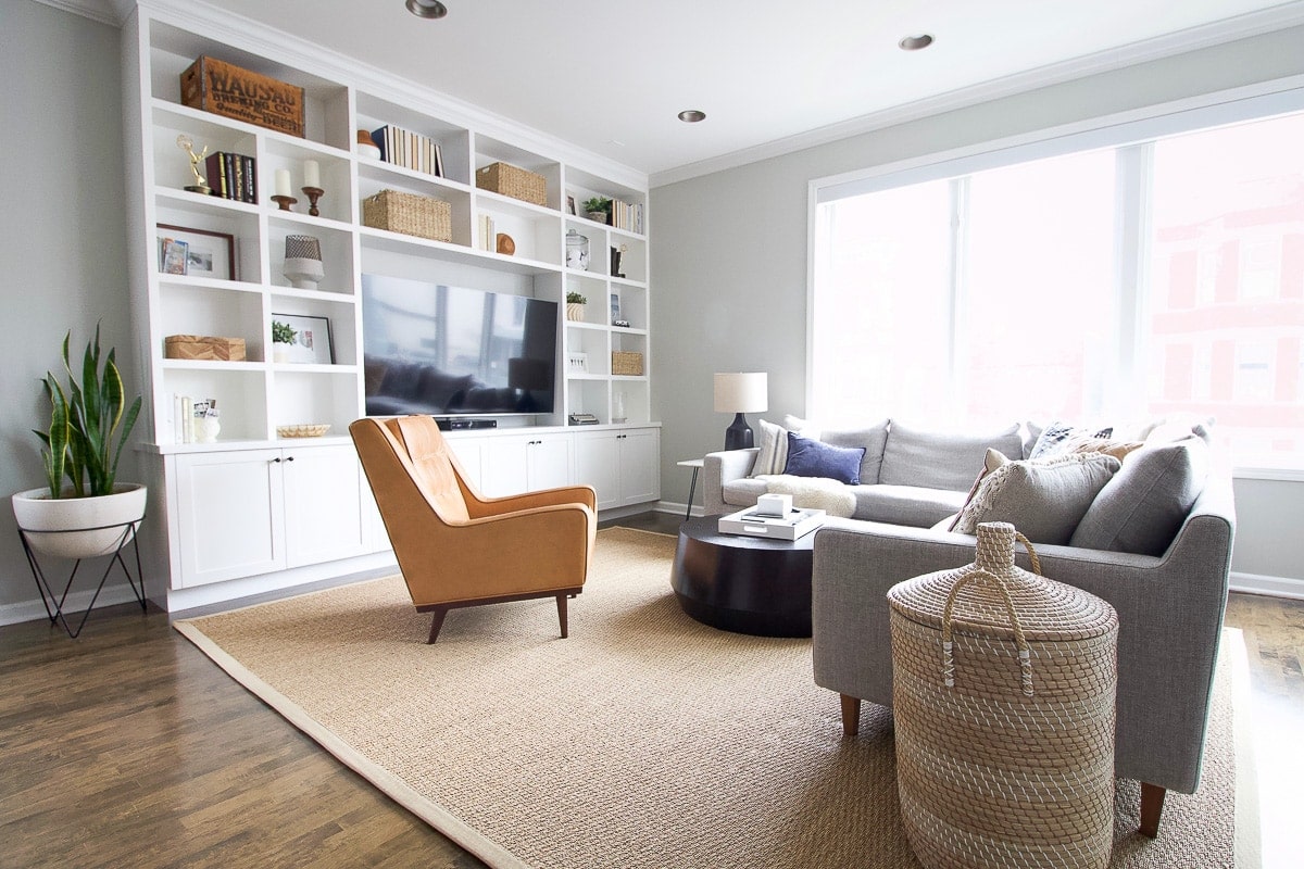
In the living room, I used a large area rug and built-ins to anchor the space and make it feel like its own distinct zone.
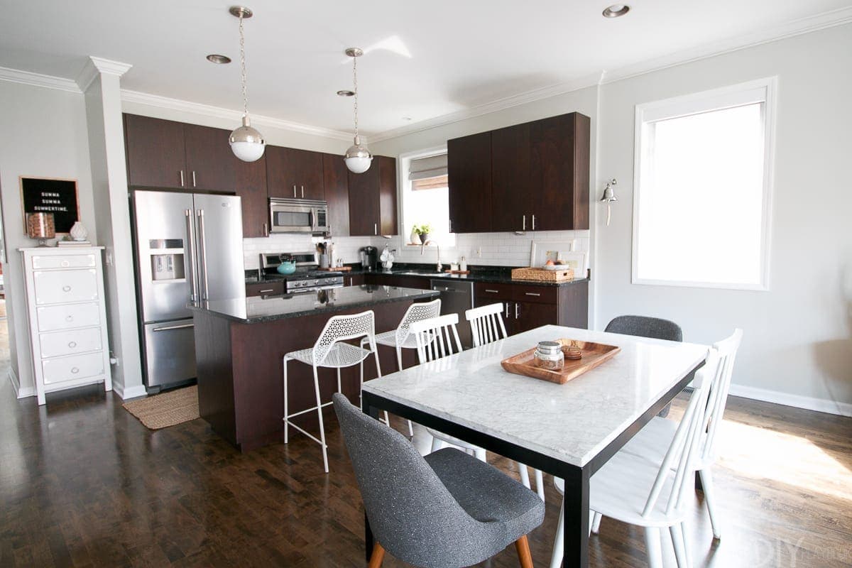
Then our dining table became the middle zone, creating a natural transition between the living room and kitchen.
That’s exactly how I’d approach Hayley’s space. You don’t need walls to make an open floor plan feel like it has separate rooms. Instead, you can use furniture placement, rugs, lighting, and even architectural details to visually define each area, while keeping everything open and connected.
The Fix: Let the Architecture Define the Zones
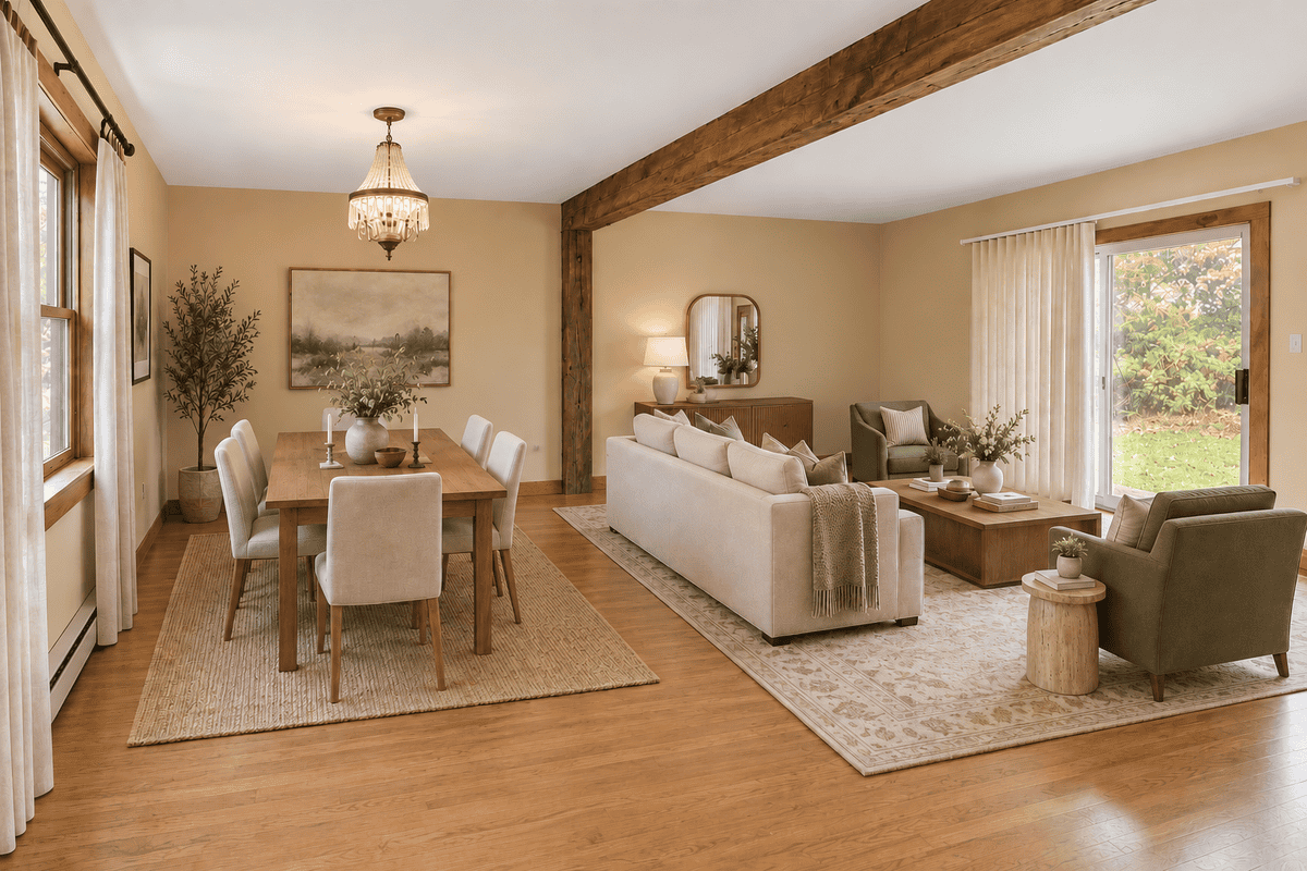
Hayley’s room already has one big advantage: the architecture is practically telling us where to divide the space! That gorgeous wood beam is the architectural feature that creates a natural break in the room, so I’d use that as my starting point instead of trying to create a new boundary.
One important note before we get into the plan: Because I don’t have Hayley’s exact dimensions, the room size in my mockup is only an estimate. Before buying anything, I’d use painters tape to tape out the floor and make sure everything flows.
1. Create the dining zone under the chandelier.
The existing chandelier makes this an easy decision. I’d center a dining table underneath it and add a large rug below (a washable one would be ideal) to visually anchor the entire area. Now everything on this side of the wood post reads as the dining room, even though there aren’t any walls separating it from the rest of the space.
2. Use another large rug to establish the living room.
On the other side of the beam, I’d bring in a large area rug to define the living area. Using rugs in both spaces creates two clear zones, while still allowing the rooms to feel connected. I’d just choose rugs that complement one another rather than using the exact same style. This post dives into my best tips for choosing a rug for your space.
3. Float the couch in the middle of the room.
This is probably the most important furniture-placement decision in Hayley’s space. Instead of pushing the couch against a wall, I’d float it with the back facing the dining area. The couch itself becomes a visual boundary between the two zones without blocking sightlines or making the room feel smaller.
I’m a big fan of floating furniture when the layout allows, and I have a whole post on how to float a couch in a living room if you want more tips to make this arrangement work.
4. Build the conversation area from there.
Once the couch is in place, I’d add two chairs on the opposite side with a coffee table in the middle. This keeps all of the living room furniture oriented toward one another and contained within the rug, rather than having pieces scattered throughout the open space.
I’d also add a console along the back wall for some closed storage and height. Just make sure there’s still plenty of clearance around the sliding door so that area remains easy to access.
The end result is still one large, open room, but now it has two very clear purposes. The beam and post establish the natural divide, while the rugs, lighting, and furniture placement reinforce it. No walls or room dividers necessary!
How to Make an Awkward Living Room Layout Work
Hopefully these awkward living room layout ideas show that you don’t need a major renovation or all-new furniture to make a tricky space work better. For Bonnie, the solution was creating a clear walkway through the room. For Hayley, it was using furniture placement and area rugs to create different zones within one large open-plan space.
When you’re struggling with your own layout, start by thinking about how you actually use the room. Where are the natural entry points? What paths need to stay clear? Where do you want people to gather? From there, use painter’s tape to map out your largest pieces and experiment before moving heavy furniture or buying anything new.
Every room is different, but sometimes a few small shifts are all it takes to make these tricky spaces finally click.
Have a design dilemma of your own? Submit it for a future DIY on the Fly! I’d love to take a look and brainstorm a solution.