Rookie Review: Our Paint Colors
A couple of months ago, we started a series called Rookie Review. For our first edition, we provided an honest review of each of our sectional couches, which you can read all about here!
Reviewing Our Homes’ Paint Colors
In this post, we’re moving onto the 2nd most asked question around here….”How do you like the paint colors in your house?” <–– Today is all about reviewing all of the paint colors on our walls without holding back…a.k.a. delivering some serious REAL TALK!
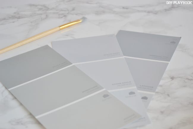
What is it about paint that makes it so dang hard to choose the perfect color? You can look at swatches until your eyes cross, and still not be completely confident that you chose the best color for your space. We totally get it and are in that same boat every single time we go to paint a room.
So let’s review the paint colors we each have in our spaces, and give you our honest thoughts on our choices.
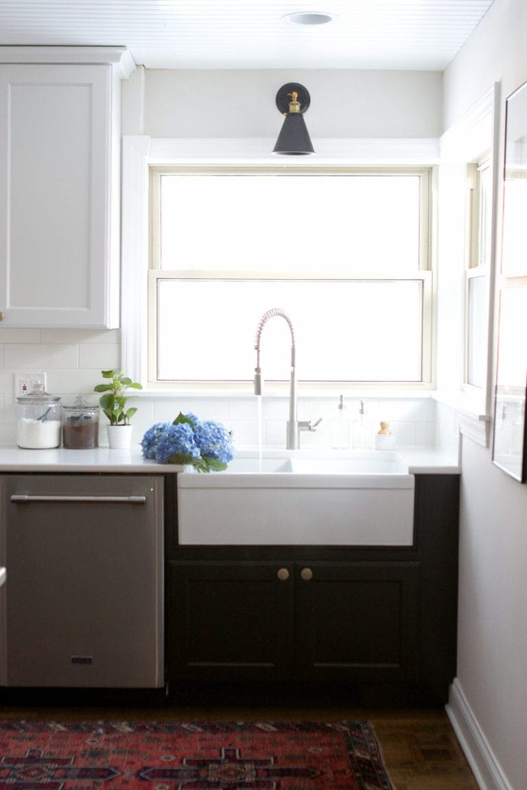
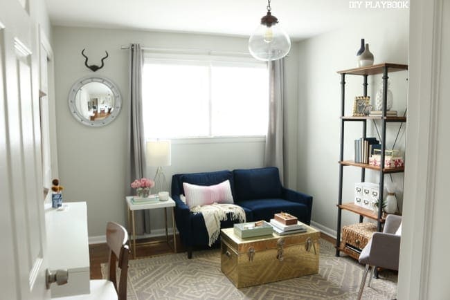
Casey’s Bedroom/Family Room/Kitchen – Benjamin Moore “Gray Owl” (#2137-60)
Overall Grade: A-
A majority of our condo is painted in the color “Gray Owl,” and luckily I really like the paint color. It’s a nice light gray, with a very slight blue undertone (verrrry slight!). However, it doesn’t look too cool…which is good! Instead, it has some warmth to it, which keeps all of our spaces feeling cozy.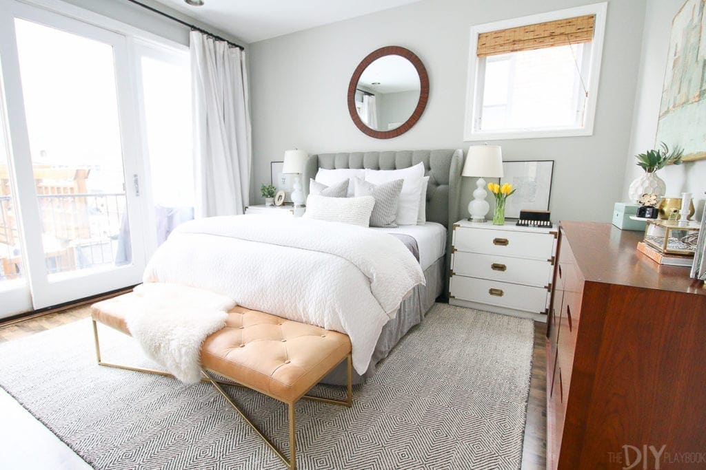
I originally painted our master bedroom a different gray color that ended up looking purple! After living with the color for 12 hours, we made a last-minute call to re-paint the room. I’m so happy that we decided to re-paint it with the color from the rest of our home.

Because we have large windows in the family room, we get a lot of light in the space. The sunshine warms up this gray color and keeps it looking fresh during the daytime.
Plus, it looks good paired with our dark wood cabinets and black countertops. All in all, a really nice light gray paint color that looks good next to just about anything!
Casey’s Bathrooms – Sherwin Williams “Repose Gray” (#7015)
Overall Grade: B
I’d have to give this color a solid “B.” It isn’t bad…but it isn’t amazing. Instead it just kinda does its job. 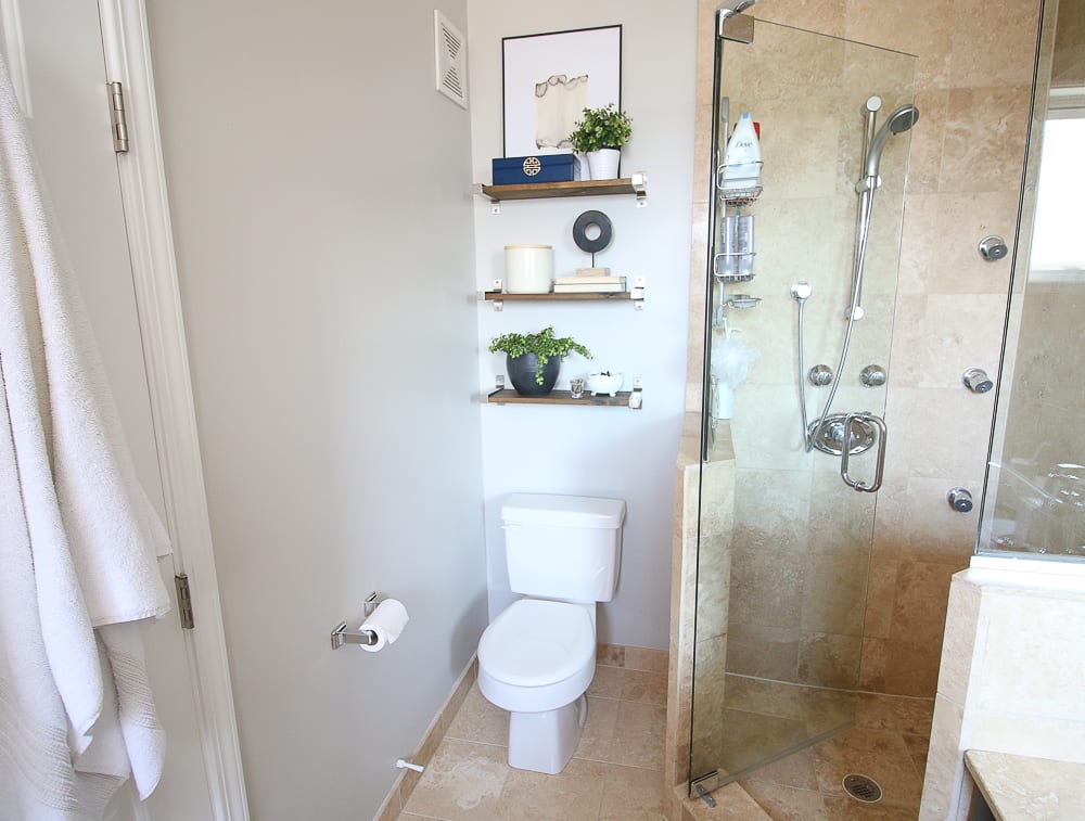

Because all of our tile is tan, I needed a paint color that would complement the warm, ruddy tones of the flooring & shower. This color pairs well with the tan, and doesn’t look too cool or stark next to it.
Our guest bathroom doesn’t have a window, so I didn’t want anything too dark for the space. I think this color works pretty well in there and it looks okay next to the vanity lighting. Overall, a nice choice for a gray…but certainly not my absolute favorite.
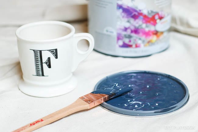
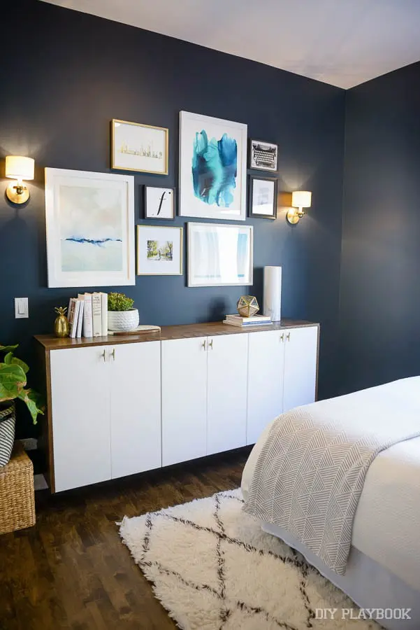
Casey’s Guest Bedroom – Valspar “Dutch Licorice” (#4008-4C)
Overall Grade: A+
I can’t believe I’m giving such a dark color an A+ on the scale, but that’s how much I adore this color. The gray/white loving gal has converted to the dark side. I seriously love this navy we painted in our guest room. 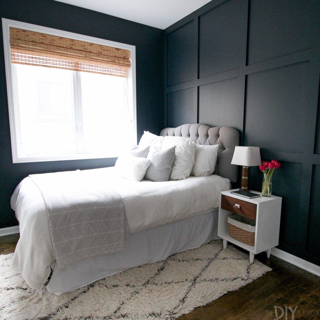
It isn’t too blue, or too black. Instead, it’s a nice mix of both. The navy makes the white trim and the light accessories of the room pop. 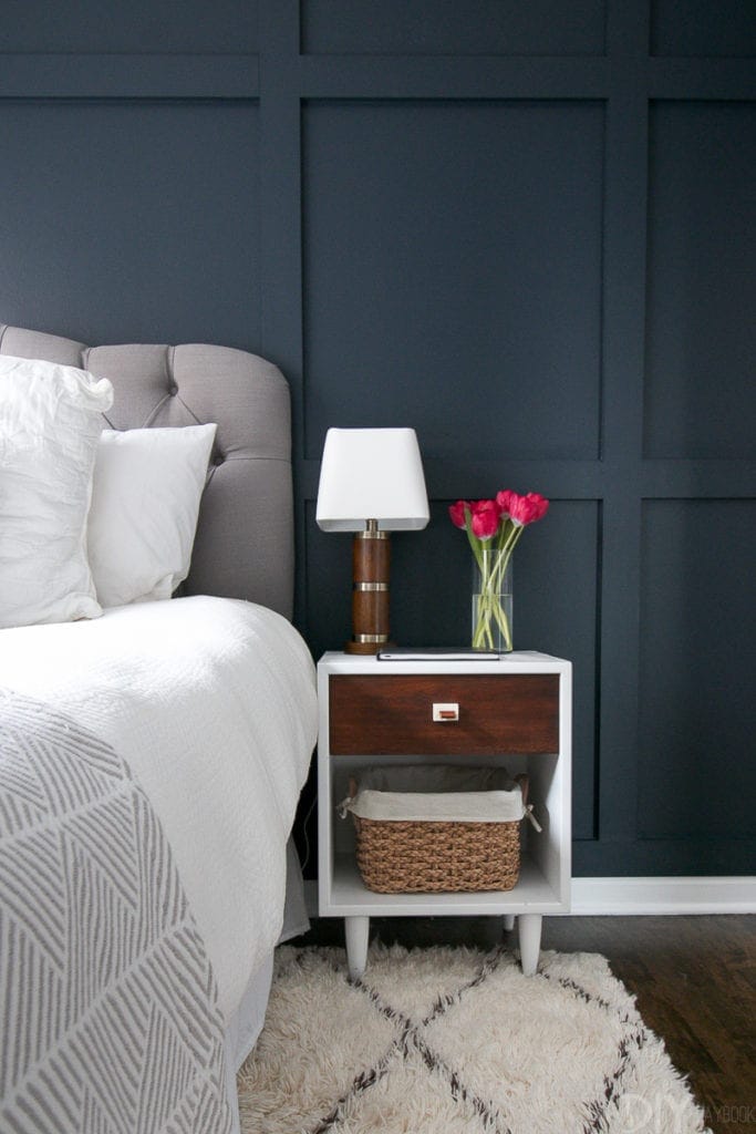
And when the sconces and ceiling light are on…it is nice and moody in here.
I know the space has only been painted for a couple of months now, but I am still absolutely obsessed with this dark color. It’s cozy & refreshing all at the same time, and every time I walk into the space it makes me feel like I’m in a luxury hotel.
Of course, I’m terrified to ever paint over this color (holy moley I would need 10,000 gallons of primer), but let’s just hope it can work for my “someday nursery.”
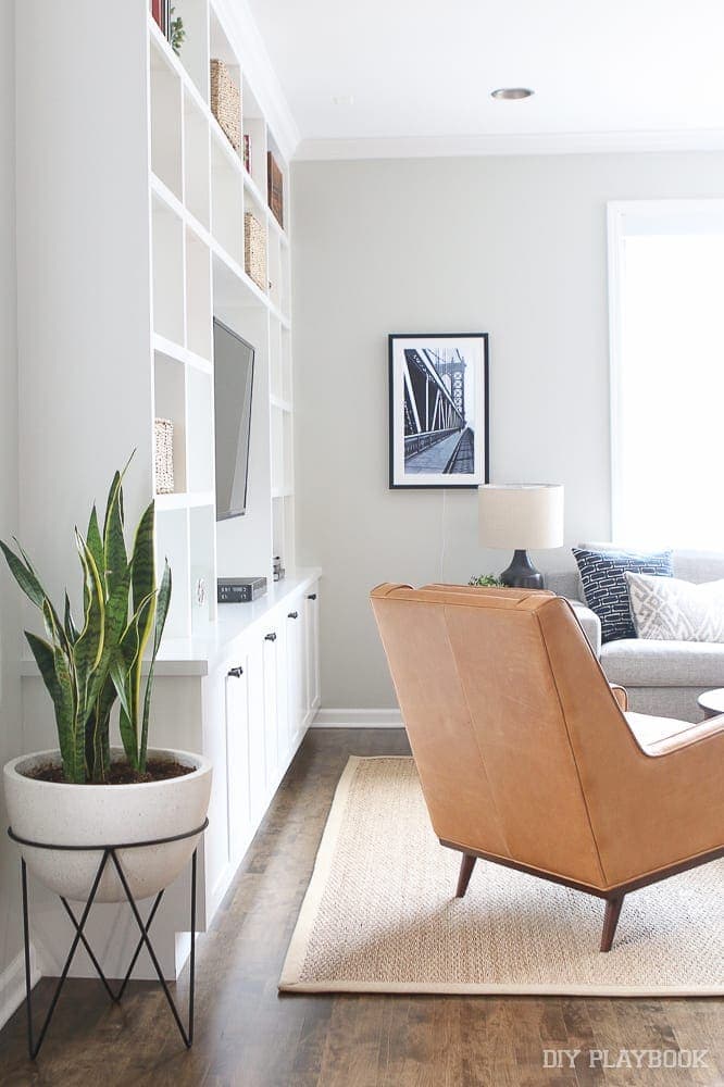
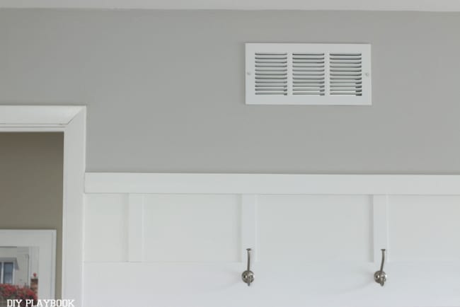
Bridget’s Family Room, Dining Room, Hallway, Bathroom – Benjamin Moore’s “Revere Pewter” (HC-172)

Overall Grade: A+
Since this color is in almost every room in our house, it’s probably safe to say that I love it… maybe a bit too much actually.
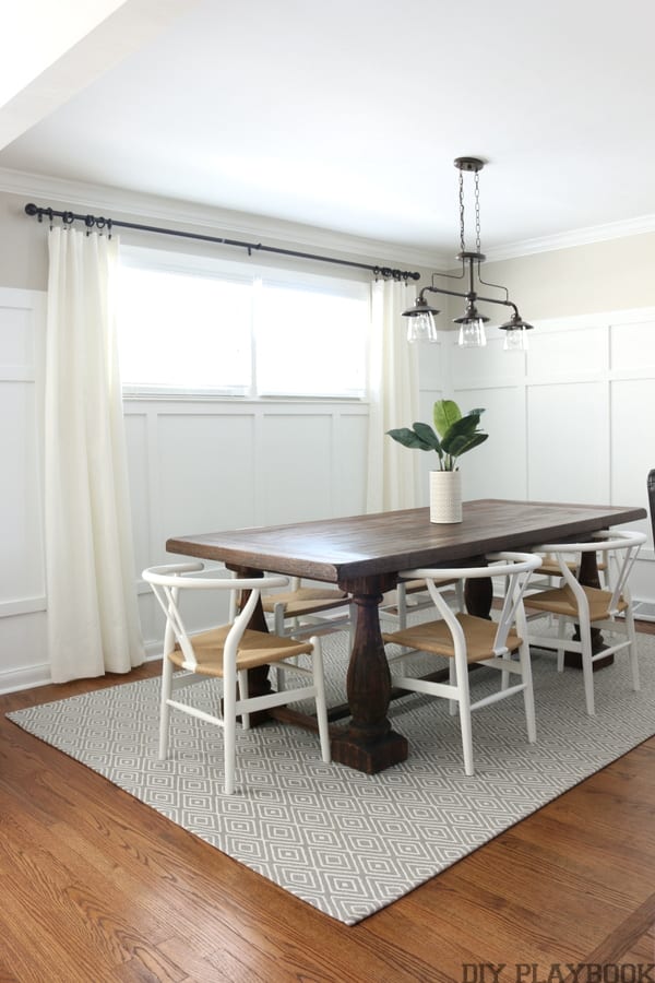
I love that Revere Pewter is a super warm gray and can work with browns and woods (like my kitchen and dining room table) but can also work well with cool grays (like my couch and rugs) at the same time. If a gorgeous pure gray paint color and a light tan paint color had a child — I swear it would be Revere Pewter.
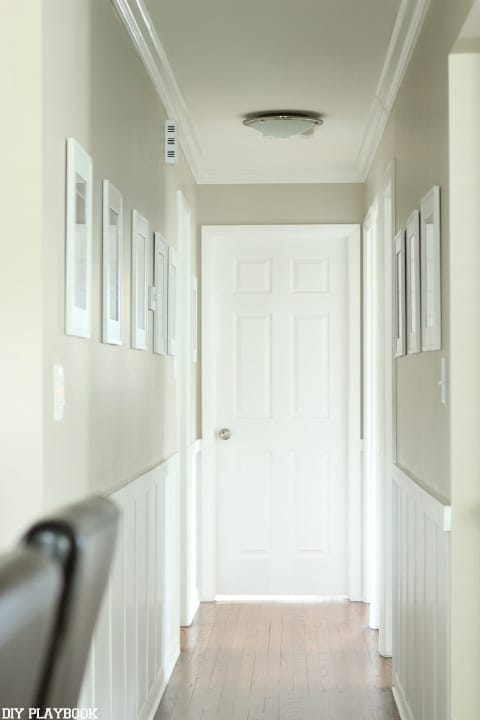
I feel like this color is a bit of a chameleon throughout the day (much like most paint colors, I guess) because it looks tanner and less gray with the sun streaming in during the morning, yet transitions to more of a warm gray and less of a tan without the sun. With paints, I usually hate that the color looks so different all the time, but for some reason, that’s one of my favorite parts of this color.
So the ultimate question to test how much you love something — would you use this paint color again?! Honestly, if I had to paint my house all over again RIGHT NOW, I would choose the exact same color. There are not many things in my house that I added right when we moved in that I would do exactly the same right now, so the fact that I can say that about this paint means I must really LOVE it!
Bridget’s Bedroom – Valspar’s Filtered Shade (#4003-1B)
Overall Grade: A
We just replaced the paint in our bedroom from a sandy-tan color to this light gray, and I’m so glad we did.
I love how CLEAN this light gray is, especially next to the white accent walls we have throughout our room. Filtered Shade is definitely not a paint color that steals the show but it is a paint color that could be recognized for “best supporting role” because of its ability to allow the other decor in the space to really shine without being too bold or too dull.
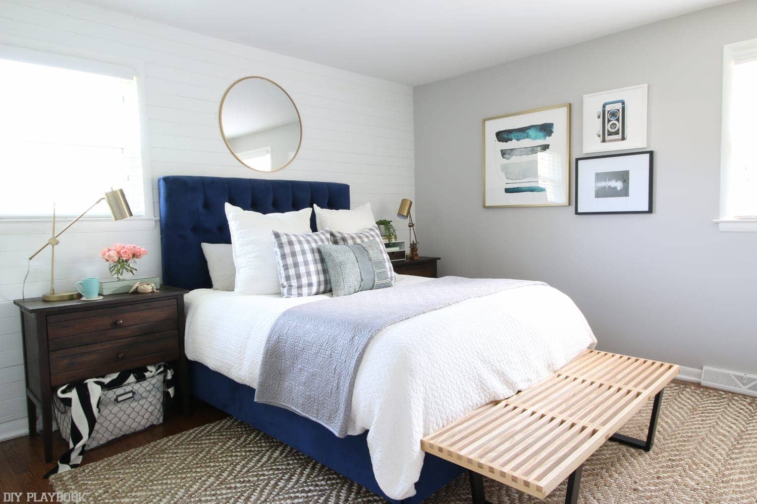
I feel like the pure, clean gray is the perfect match for our bold navy headboard and the gold, black, and neutral elements in this space. I actually liked the “supporting role” of this paint color so much that we used it in our recent Nursery Project.
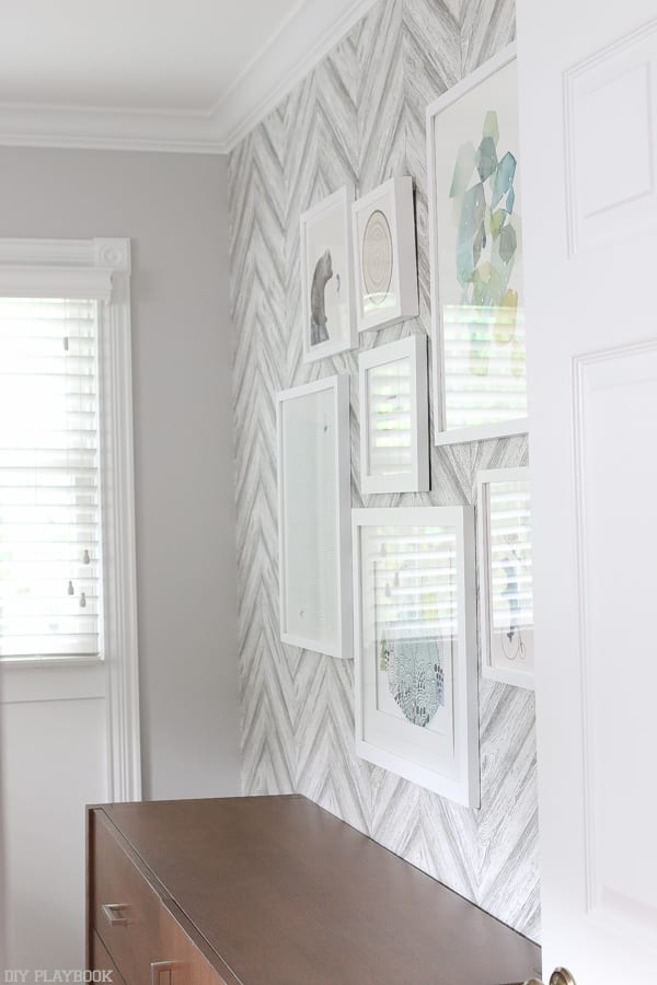

In this space, it flattered the wallpaper we chose and was the perfect paint to let the artwork and colorful accents shine. If you’re looking for a clean, light gray that will support the other design choices in your space…. I would highly recommend Valspar’s filtered shade!
Bridget’s Office – Benjamin Moore’s “Moonshine” (#2140-60)
Overall Grade: C+ or B-
We painted our office Benjamin Moore’s Moonshine right when we moved in and it has definitely served its purpose since then. But if I’m being completely honest I don’t LOVEEEEE it like the other paint colors in our home. It is extremely light and casts a hint of blue under the gray. Not that that is necessarily a bad thing, it just wasn’t exactly the look I was going for. I do NOT hate it (not at all), but if I had to do it again I would probably pick a different gray.
However, if you are looking for a VERY light gray color that has a very slight hint of light blue… Moonshine may be perfect for you!
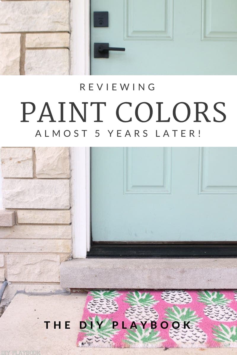
Bridget’s Front Door – Benjamin Moore’s “Covington Blue” (HC-138)

Overall Grade: A+
Hands down one of my ALL TIME favorite design decisions I have made while in this house was to paint our front door Covington Blue. Not only did I paint the outside of the front door, but I also painted the interior of this door and still to this day, it is by far one of my favorite projects.

This “pop” of color in our small space makes me smile everyday and surprisingly fits in our decor all year round. I was nervous about painting our front door this bright blue because I wasn’t sure how it would look during the fall and winter but I ended up really loving it all year long.
Choosing Paint Colors Can Be Overwhelming
We know choosing paint colors feels so hard and overwhelming, and we wanted to share our honest feedback about our journey with paint. It’s important to know that although some of our paint decisions were spot-on, others were NOT (!!!). It’s hard to imagine what a paint color will look like in an entire space and even harder to predict how you will like it after living with it for a few months. But rest assured at the end of the day, it’s only paint and it can ALWAYS be changed to a color that you love!!
Other Helpful Paint Resources
Looking for more paint resources?! Here are some of our most popular paint posts:
- Tips for Picking the Perfect Paint Color
- Guide on what hardware stores sell which types of paint
- Our Favorite Paint Colors
- How to Open & Close the Paint Can…. without the mess.
- Picking the perfect front door paint color
- Does paint EVER go on sale?!
Bridget&Casey